Reflection: In this image I used the gradient for both the striped background and the color behind my name.I used the flip vertical choice to duplicate the text box and drag it up to the bottom of the beginning of the first text box. Then the perspective option from free transform was used to drag the corners out for a perspective look. I added a blur to the black shadow text also.
Reflection: I used the picture of the people at the restaurant as my main background picture. Then I downloaded smaller pictures of food for the other background pictures. The polaroid effect was used to create the frame around the inside of the picture. I used stroke to create the outside border and also added a drop shadow. After one of these was created you could just hold control and copy it to the rest of the pictures.
Reflection: I used the colorize methods on this picture to take out all the color in the picture by desaturing the layer. I decided to recolor the background trees, the dog's tongues and the little bit of orange at the bottom. I had to duplicate the background layer and then re-duplicate the duplicated layer. I used a large eraser with a thin brushed edge in the background and a smaller brush to recolor the tongues.
Reflection: I used the cell phone image as the picture to put my other photo inside. Select all of the picture to put into the image. In the original image I drew a selection around where I wanted the photo to appear. Paste into let me take the copied photo in the rectangular selection. I free transformed it to fit the size of the screen. The final steps were just adding text to advertise the phone company. I used the real logo of the verizon company. My background image (black and white) and the image in the phone are the same image. I think this project turned out really well and it's a good skill to know how to use for future projects.

Reflection: I started by creating a black background to drag the image of the watch onto. Free transform allowed me to resize and give the watch a 3D perspective. Then I created a new layer and filled it with black while I had the watch selected. I lowered the opacity of the layer so it appeared in the background. Another new layer was created and filled with black and I created a box selection. Feather selection gave softer edges to the box and it knocked out a skewed watch on the layer beneath. Then I used the same watch picture for the bottom picture of the watch that you can see more clearly.
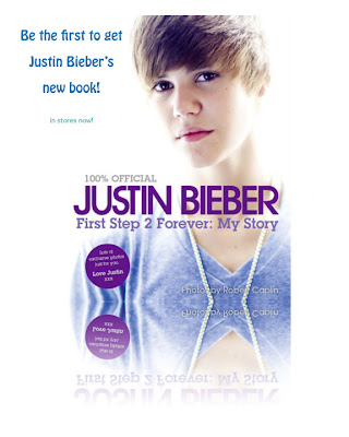 Reflection: I added a fade away reflection to the original to make it look like it was fading out at the bottom. I duplicated the layer with the image on it and flipped it vertical and moved that second layer down so it was just touching the first layer. A Layer mask was added and the black to white gradient created the reflected picture fade away. I like this project because it is simple, but looks professional.
Reflection: This project included drawing vertical lines of different widths throughout the whole layer. This is how the name got the striped, distressed look to it. Under the filter menu I used mezzotint to create chips out of the lines. When you re-select the name to appear the lines show through and make the text look more distressed. I like the gradient background I used in this project also.


 Reflection: I added a fade away reflection to the original to make it look like it was fading out at the bottom. I duplicated the layer with the image on it and flipped it vertical and moved that second layer down so it was just touching the first layer. A Layer mask was added and the black to white gradient created the reflected picture fade away. I like this project because it is simple, but looks professional.
