Monday, May 23, 2011
Image Blending
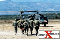
Reflection: I like this project because the blending turned out really well and the two images together appear as they are one. The first image was the three players, I inserted that one first and then the bigger close up picture overtop of it. I added a layer mask and switched my foreground color to black. I used the brush to reveal the picture beneath it. After those two photos were blended, I blended the bottom picture into the background by using the same brush technique. The final steps were desaturating the image to take the color out and adding noise. The brown tint was made by choosing solid color from the create new adjustment layer.
Putting an Image in a Monitor
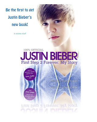
Reflection: To start this project, I opened two pictures, the Justin Bieber picture and the billboard. I moved the Justin Bieber image into the billboard. I free transformed to fit close to the size of the billboard. I lowered the opacity of the layer so it was easier to position within the billboard. By using the free transform again, I held the command key and grabbed a corner point to match it exactly within the billboard. The last thing I did was put the opacity back to 100% and add text.
Friday, May 20, 2011
Cast Shadow
Reflection: The first step of this project was to create a new layer and make an oval in it. I softened the edges of the oval by feathering it, and added a lighter green color to it. Then I created a double soft spot effect by choosing contract and shrinking the size of my oval. I switched the foreground color to an even lighter green. I then merged the soft oval layer with my background layer. I created a new layer to fill with the darkest green. A burned in portrait effect was created and then I moved the steering wheel into the green background. The last steps were creating a shadow behind the wheel and adding text at the bottom. I like the glow on the words at the bottom and how the greens blended together for the final project.
Thursday, May 19, 2011
Olympic Photo Tint
Reflection: The first image shown was the picture I used for my main background picture. I moved it onto a blank document to start and added a hue/saturation to create the blue saturated tint to the picture. I also added a stroke to create the teal border around the image. I added an outer glow and shadow to the picture so it had an extra pop and almost looked 3D. The final steps were just adding text and the bottom quote. I added another stroke to the top text to make it more noticeable. I like this project because it was really simple to complete but still looks good and I used a lot of previous knowledge to add the little extra things.
Tuesday, May 17, 2011
DVD Menu
Adding a Window to Another Place
Reflection: I used the original picture as my background image to begin. I created the window shape by using the marquee tool to first create a circle, then a rectangular shape to make the window. I pasted the second image into the window. The inner glow was created from the add a layer style pop up menu. I like this project because the background image and window image fit well together and it looks neat and clean.
Monday, May 16, 2011
Flower Stamp
Reflection: I chose this project because it is simple but turned out really nicely and professional looking. The first step was to create extra white space around the image and use the eraser tool to knock out holes of the white border. I used a small, hard-edged brush and made the spacing even all the way around. I made a work path and chose a stroke path and selected eraser. Photoshop basically did the rest of the work by erasing on the path I created and leaving cut outs of the half circles.
Thursday, May 12, 2011
Perspective Shadow
Reflection: In this image I used the gradient for both the striped background and the color behind my name.I used the flip vertical choice to duplicate the text box and drag it up to the bottom of the beginning of the first text box. Then the perspective option from free transform was used to drag the corners out for a perspective look. I added a blur to the black shadow text also.
Wednesday, May 11, 2011
Polaroid Effect
Reflection: I used the picture of the people at the restaurant as my main background picture. Then I downloaded smaller pictures of food for the other background pictures. The polaroid effect was used to create the frame around the inside of the picture. I used stroke to create the outside border and also added a drop shadow. After one of these was created you could just hold control and copy it to the rest of the pictures.
Colorize Puppies
Reflection: I used the colorize methods on this picture to take out all the color in the picture by desaturing the layer. I decided to recolor the background trees, the dog's tongues and the little bit of orange at the bottom. I had to duplicate the background layer and then re-duplicate the duplicated layer. I used a large eraser with a thin brushed edge in the background and a smaller brush to recolor the tongues.
Putting one image inside another image
Reflection: I used the cell phone image as the picture to put my other photo inside. Select all of the picture to put into the image. In the original image I drew a selection around where I wanted the photo to appear. Paste into let me take the copied photo in the rectangular selection. I free transformed it to fit the size of the screen. The final steps were just adding text to advertise the phone company. I used the real logo of the verizon company. My background image (black and white) and the image in the phone are the same image. I think this project turned out really well and it's a good skill to know how to use for future projects.


Using one photo as the background and focal point
Reflection: I started by creating a black background to drag the image of the watch onto. Free transform allowed me to resize and give the watch a 3D perspective. Then I created a new layer and filled it with black while I had the watch selected. I lowered the opacity of the layer so it appeared in the background. Another new layer was created and filled with black and I created a box selection. Feather selection gave softer edges to the box and it knocked out a skewed watch on the layer beneath. Then I used the same watch picture for the bottom picture of the watch that you can see more clearly.
Fade Away Reflection
 Reflection: I added a fade away reflection to the original to make it look like it was fading out at the bottom. I duplicated the layer with the image on it and flipped it vertical and moved that second layer down so it was just touching the first layer. A Layer mask was added and the black to white gradient created the reflected picture fade away. I like this project because it is simple, but looks professional.
Tuesday, May 10, 2011
Distressed Type Effect
Reflection: This project included drawing vertical lines of different widths throughout the whole layer. This is how the name got the striped, distressed look to it. Under the filter menu I used mezzotint to create chips out of the lines. When you re-select the name to appear the lines show through and make the text look more distressed. I like the gradient background I used in this project also.
Snapshot to Car Ad
Reflection: I used a picture of a still photo and used blurring techniques to make it look more professional and as if it were moving. I tinted the windows to a darker shade and added the blur to the tires and backside of the car. The blur I used was the motion blur for behind the car and a radial blur for the circular path around the tires.
Graduation Announcement
Reflection: I used these four images to put together a graduation announcement. I used the clipping mask effect. This technique is commonly used for giftcards, invitations or announcements. I liked this project because we had more freedom to create it on our own. The pictures are all different but are used for one common collection of pictures. I feel like it turned out well balanced and put together neatly.
Paris Stamp
Reflection: This is one of my favorite projects because it is simple but it still looks like a real stamp. The stamp affect was created by cutting half circles out of the edges of the extra border that was added. Simple text was added to make it more interesting.
Glee DVD Menu
Reflection: I created this DVD menu of the popular TV show Glee. I used a background image and desaturated it first to remove all color. I chose red as the background color to add the grainy look with. Each DVD menu button is a different picture fit to the size of the fixed circle. I added text for subtitles with glow around the outside to make them pop a little more. This technique would be used a lot in Hollywood to make DVD menus. I think the color scheme worked well.
Colorize Baby Photo
Reflection: For this project I used the colorize option in photoshop. I took the all the color out of the original picture by desaturating it first. I picked out the eyes and the lips to recolor. These features when colored pop out of the picture and provide a focal point for the picture.
Blending Two Images
Reflection: I used blending techniques to blend from one image to another. This is often used in Hollywood to create movie posters. My background image was the water and cloudy sky and then overtop of that I used dolphins jumping out of the water. My background color was blue and I think the color choice for the background added a nice affect to the overall picture.
Picture in Words
Reflection: I used a large picture to fill the space of the word dream. The text had to be large enough and thick enough so you could make out what the background image was. Clipping masks were used and a drop shadow was added. The use of enhancements was also helpful such as bevel and emboss and stroke.
Subscribe to:
Comments (Atom)


